
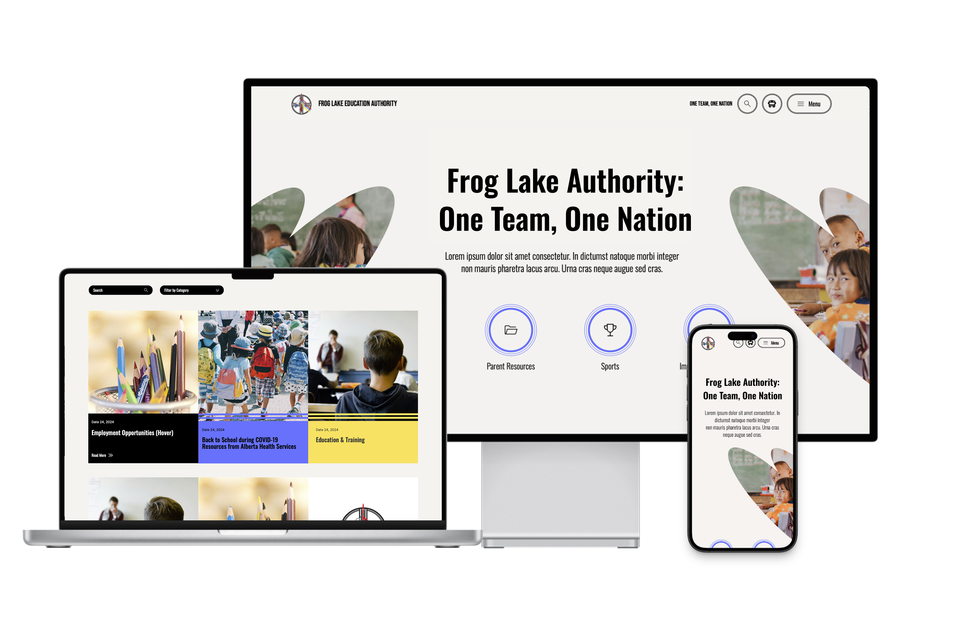
A live school authority website serving Frog Lake First Nation. I designed the interior page layouts for news, articles, and directories by extending a homepage style that was already in place.
Frog Lake Education Authority is the main site families rely on for school news, registration, and calendars. It serves Frog Lake First Nation in Treaty 6, and it needed to feel easy to use and trustworthy.
My job was to design the interior pages for news, articles, and directories, working from a homepage style that was already set. The layouts had to stay consistent no matter what content staff added later, because the site runs on a CMS that school staff manage themselves.
Pages built as one system.
Design System
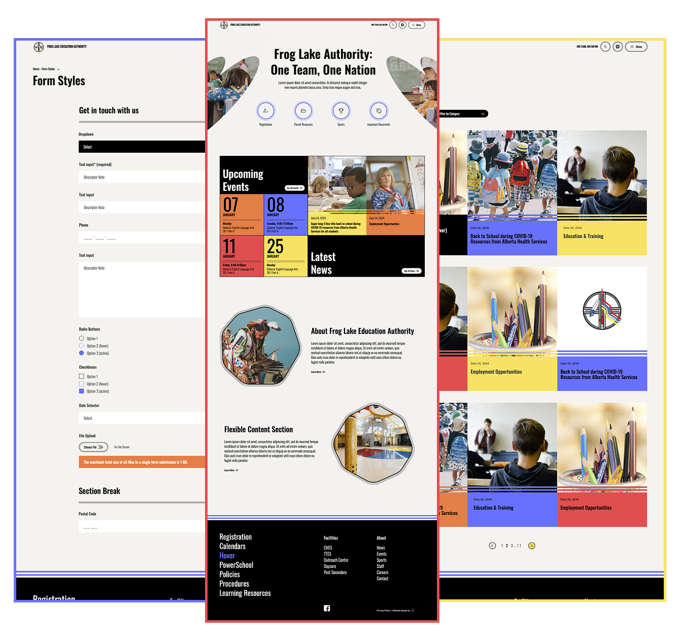
One visual language across every page
· I carried an inherited visual language across every interior page. Asymmetric image masks, condensed display headings, a repeating accent colour set, and octagonal photo frames.
· Consistency was the whole job. A school site has many page types, and keeping them visually unified is what keeps it usable.
· The same type hierarchy, colour logic, and motifs run from news index to article to directory. So families never have to relearn the site as they move through it.
TEMPLATES
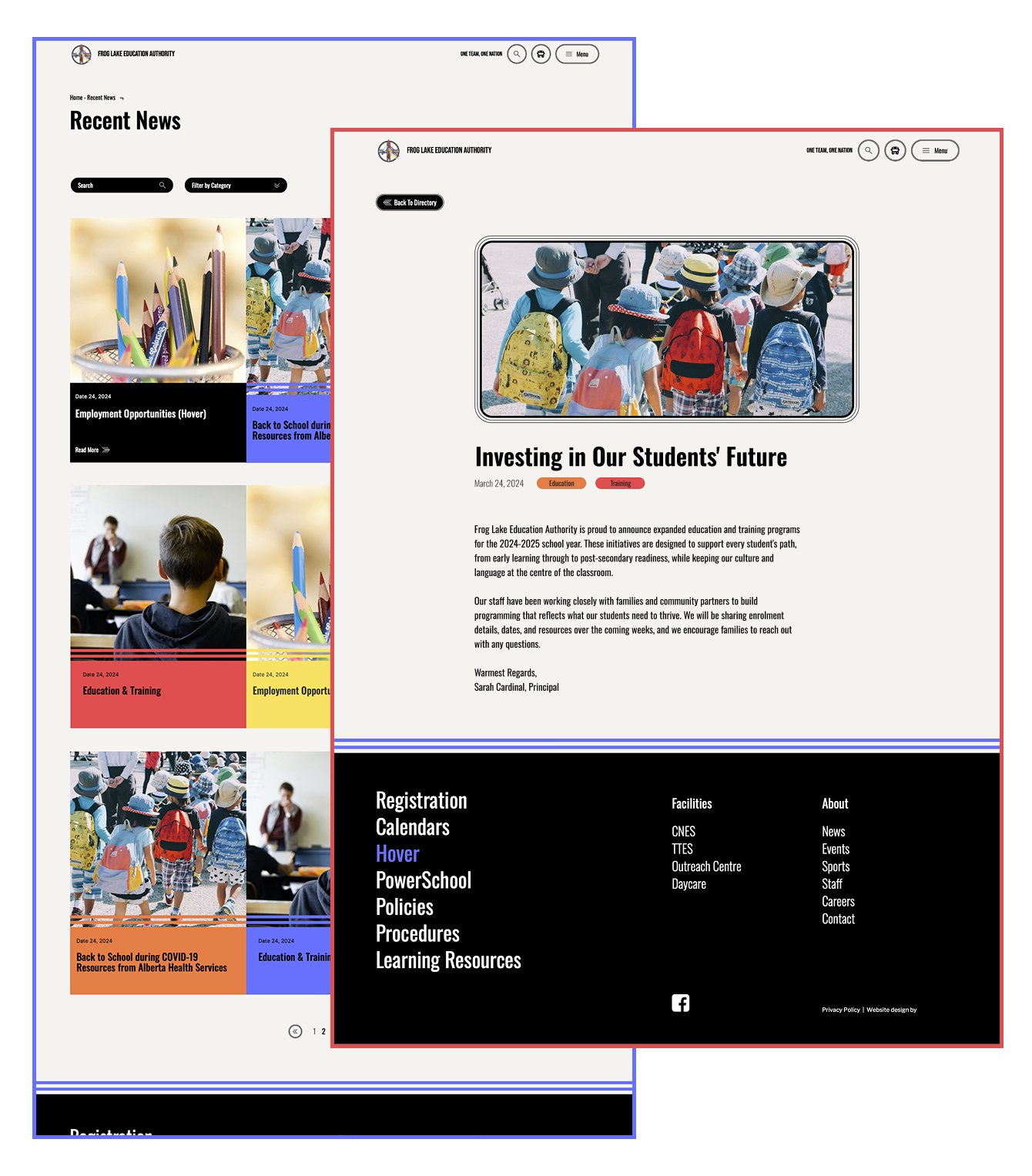
News index and article template
· I designed the news index as a fast-scanning, color-blocked grid. Each story is a clear, tappable unit, since news is the most-used part of the site.
· Accent colors rotate across cards to create rhythm without a new layout per story. One template flexes to hold everything.
· The article template carries the system inward for calm, legible reading. Large headline, clear date and category tags, readable body width, no jarring shift from the colorful index.
RESPONSIVE
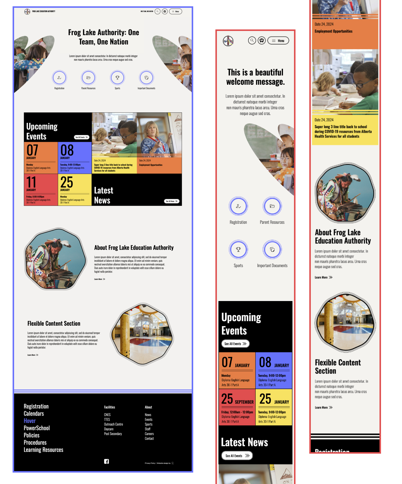
Responsive layout
· Layouts hold their hierarchy from desktop down to phone, where most families reach the site. Mobile was the priority, not an afterthought.
· The hero collapses from a wide split into a single stacked column. Headline first, image below, with nothing important lost.
· Full navigation condenses into a menu on small screens. The structure stays usable at every width.
NAVIGATION
Navigation and directory
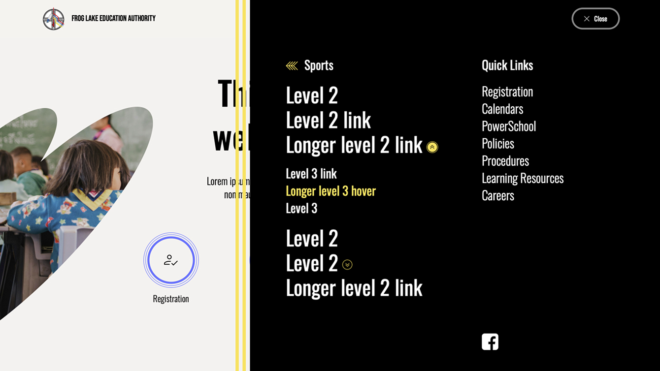
· I designed the directory and expanded menu to surface a complex multi-school structure clearly. Each school carries its own news, calendar, sports, documents, and registration.
· Schools group their own sub-pages, and quick links pull the most-requested items to the top. Families reach what they need in fewer clicks.
· The article template carries the system inward for calm, legible reading. Large headline, clear date and category tags, readable body width, no jarring shift from the colorful index.
COMPONENTS
Forms and interface components styling
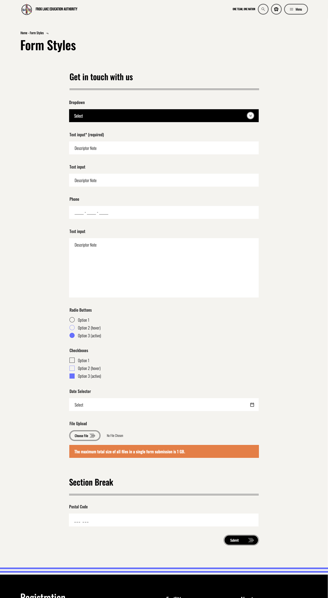
· I applied the site's visual design across the full form system, styling every input state. All components read as one consistent set.
· I made sure the styling held up across every form element and state, including the validation and file-size messaging. The look stays consistent whether a field is empty, focused, or showing an error.
Because schools manage their own content through the CMS, the live site reflects each school's own updates, not a fixed design. It is real, shipped web design, a multi-page system I helped build and carry across the templates that run the site.
An established visual language carried across news, article, and directory templates so the whole site reads as one thing. That consistency is the core of the work.
Every text-on-colour pairing is checked against WCAG AA and AAA, and the bold sans-serif type is a legibility decision. On mobile, buttons and tap targets are sized large so they are easy to hit.
The layouts stay responsive from desktop down to phone, where most families reach the site. Hierarchy holds at every screen size.